
Bringing high-speed offshore racing to
Toronto’s waterfront.
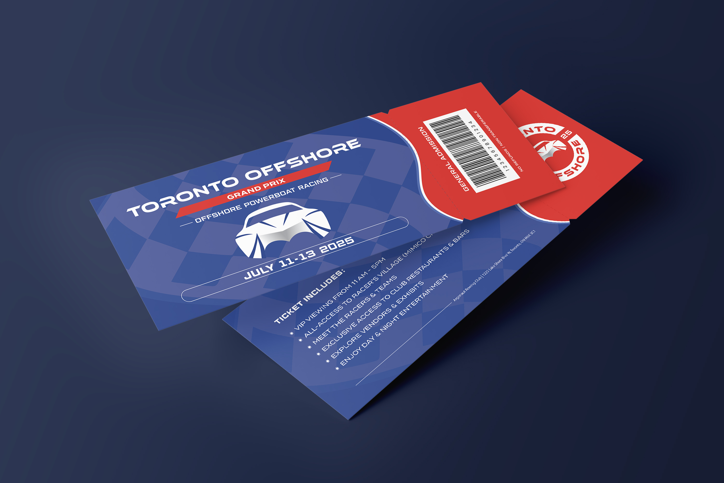
The Toronto Offshore Grand Prix is an offshore powerboat racing event that will be held in Toronto for the first time. This was a branding project developed in collaboration with the NEXT Student Agency, which helped guide the creative direction and overall approach. While the strategy team focused on positioning, audience insights, and event planning, the design team was responsible for the visual identity. My role included conceptualizing and designing the logo, selecting typography and colours, and creating branded assets for social media, merchandise, and promotional materials.


Offshore powerboat racing is a high-speed motorsport where powerful boats compete across open water. The sport requires sharp focus, quick reflexes, and strong teamwork. Races are held along coastlines or large lakes, where the speed and competition make it an exciting sport to watch and a challenging sport to compete in.
Toronto has never hosted a major offshore powerboating event. The client wanted to introduce this unique sport to the city in a way that felt family-friendly and engaging, while reconnecting locals with the city's waterfront.
➝ Reconnect Torontonians with the waterfront
➝ Convert casual spectators into lifelong fans
As an art director and graphic designer, I helped turn our team's strategy and insights into a clear visual identity.

Before the branding phase, the strategy team conducted research to better understand what draws Toronto locals to summer events. The survey data was useful for shaping the event’s tone, messaging, and visual direction.
Most people preferred outdoor festivals, concerts, and family-friendly activities

Over 80% said they’d consider or definitely attend, confirming interest in a free, family-friendly waterfront event.

Free entry, location, and activity variety ranked highest, so we kept these priorities in mind when developing the visuals and layouts for print pieces and social content.

With the research in place, the design team began building a visual identity that reflected both the energy of offshore racing and the approachable summer vibe that our audience resonates with. The design needed to feel original, engaging, and easy to recognize across digital and physical spaces.

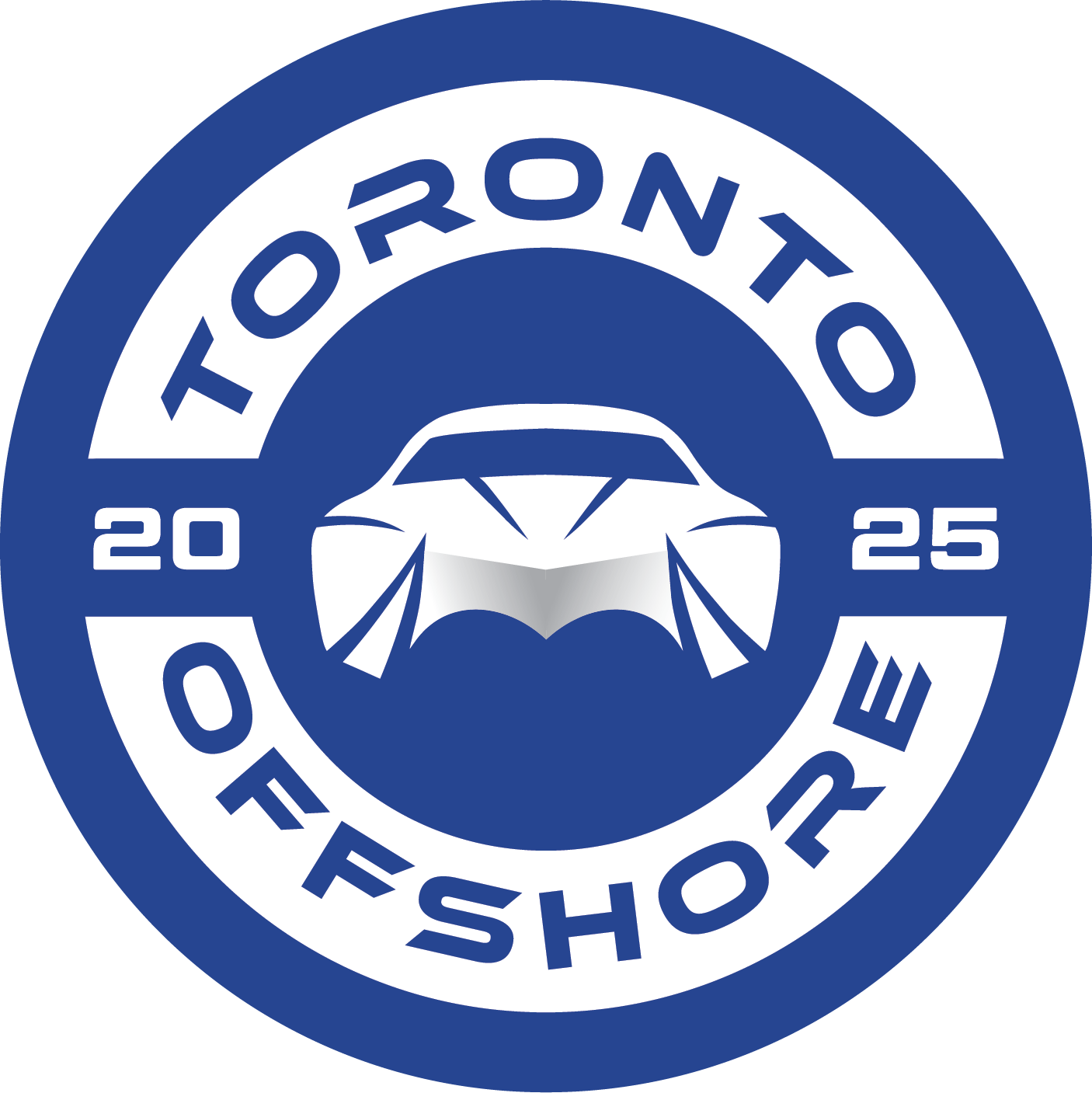
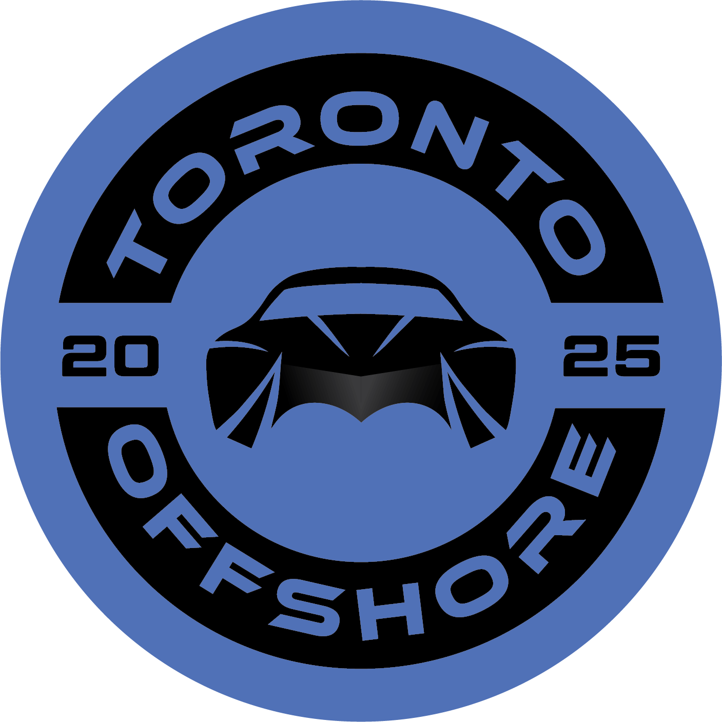
The Toronto Offshore logo is inspired by the angular shape of offshore powerboats viewed from the front. The boat outline conveys flow and precision, with the pointed lines resembling the distinctive hulls of a powerboat. The circle shape and extended date panels give the logo a badge-like feel that works well across merchandise, signage, and digital formats. The design is subtle and clean, in comparison to typical offshore racing logos, helping position the brand and event as fresh and distinct. The blues and bright accent colours help tie the identity to the waterfront and the outdoor setting.


DISPLAY TYPE ➝ Used in the logo and large headlines, Ethnocentric has an angular structure that's meant to reflect the sharp lines of powerboats. Its geometric styling creates a sense of balance and stability.

SECONDARY TYPE ➝ Geom Graphic is used for subheadings. The rounded corners contrast with the display type, giving a more neutral tone as a supporting text.

BODY COPY TYPE ➝ Termina is a sans-serif typeface used for body copy and detailed information. Its open letterforms make it easy to read in both print and digital formats.
The colour palette combines blues, bright accent colours, and neutrals to create a range that feels modern, energetic, and connected to the waterfront and summer events.


ACCOUNT MANAGER ➝ KAYLE LUREÑANA
STRATEGIST ➝ HEFZI-BA PLAZA MANCILLA | KYRA ROLFE
EVENTS MANAGER ➝ JASMINE MARCIAL
VIDEOGRAPHER ➝ MITCHELL EVELY
COPYWRITER ➝ ABHAY SHARMA
ART DIRECTOR ➝ JORDANA LEE | SIFAT CHAWLA