
Beach Cruiser is a milkshake IPA best enjoyed on a hot summer day. I wanted to create a label that would best capture that.
Working with Point Brewing Company, I was asked to design a label for one of their summer beers, Beach Cruiser. The project began with understanding the brand’s identity and what makes a great milkshake IPA. Point Brewing envisioned a design that captured the carefree, adventurous spirit of a summer day on the beach boardwalk.


A retro-inspired script typeface that reflects the golden era of beach cruisers

A friendly soft serif that complements the display type

A clean, modern sans serif with subtle weight used for smaller text

A bold, expanded sans serif that gives the brewery’s name more presence


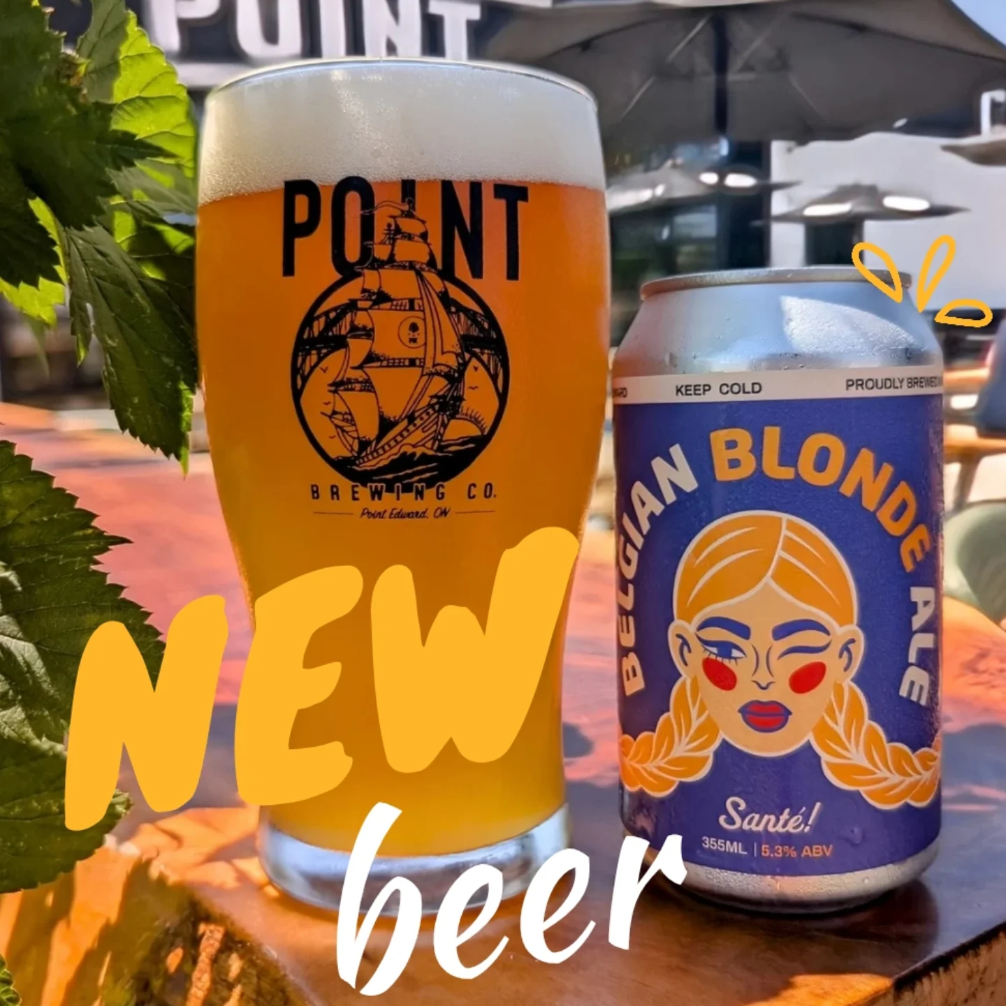
Belgian Blonde is a light, easygoing ale. The label design draws inspiration from golden grains and golden hair.
For this label, Point Brewing shared their vision for a design that visually combined golden hair and grain stalks. I ran with the idea by illustrating a Belgian blonde woman whose two braids mimic the look of barley. She gives a playful wink to reflect the beer’s laid-back and approachable personality.


A bold sans serif typeface to grab attention

A script typeface that reflects the smooth profile of the beer

A clean, modern sans serif with subtle weight used for smaller text

A bold, expanded sans serif that gives the brewery’s name more presence


